Ads Manager revamp
Rethinking Sprinklr's Ads Manager around clarity, not dopamine — a calmer transaction layer for advertisers.
- Role
- Lead Product Designer
- Contributors
- PM, Researcher, Stakeholders
- Platform
- Desktop Web
- Timeline
- 2 months
One line vision.
Transform Ads Manager into a trusted, intelligent workspace that ensures users can confidently operate, optimize, and scale campaigns without risk or confusion.
What users told us.
Trust and system state reliability
Users cannot reliably determine whether errors are resolved, and lacks true root cause of the error messaging.
Error handling is late and fragmented
Errors appear only at the review stage and must manually search across sections for issues to be resolved, impacting poor scalability for bulk operations.
Complexity and cognitive overload
The UI density overwhelms non-expert users and the third pane experience can be intimidating with lots of actions and CTA buttons to navigate through.
Ads Manager is a powerful, enterprise grade platform however users experience significant friction in trusting, navigating, and safely operating at scale.
An aging interface buried critical campaign decisions.
Sprinklr's Ads Manager had grown organically over a decade of feature additions. Power users could move quickly, but new advertisers struggled to find basic actions — duplicating a campaign, adjusting a budget, pulling a report — without contacting support.
The surface area was vast: dozens of column configurations, nested filters, and modal-on-modal flows. We needed to bring order without regressing the workflows experienced operators relied on every day.
One surface that scales from one ad to ten thousand.
We reframed the goal: the Ads Manager isn't a dashboard — it's a workbench. Operators should be able to glance, decide, and act without leaving the table. Every column, filter, and bulk action had to earn its place by reducing time-to-decision for a real, observed task.
Design principles
- Density without noise — every pixel serves a decision
- Inline editing wherever a modal used to live
- Bulk actions that preview their impact before commit
- Saved views that travel with the user across accounts
Where the experience started.
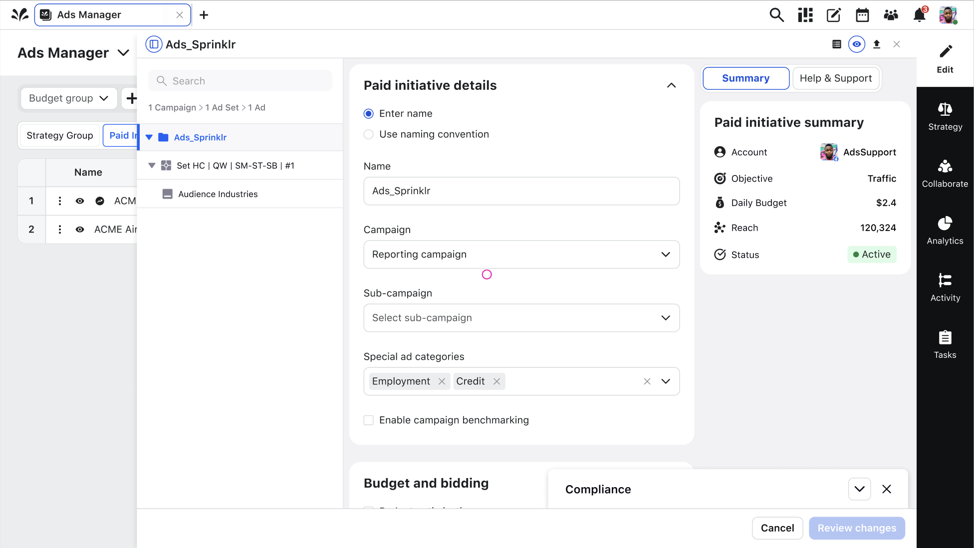
Before any redesign work began, we audited the existing Ads Manager and sat down with internal stakeholders — sales engineers, solution consultants, and support — to collect the feedback they were already hearing directly from customers. The picture was consistent: creating a paid initiative meant navigating a dense stack of panels, overlays, and summaries competing for the same attention.
Campaign details, budget and bidding, compliance, and the summary rail all lived on screen at once. Nothing was technically missing — but nothing was prioritized either, and advertisers had to hold the entire structure in their head just to complete a routine edit.
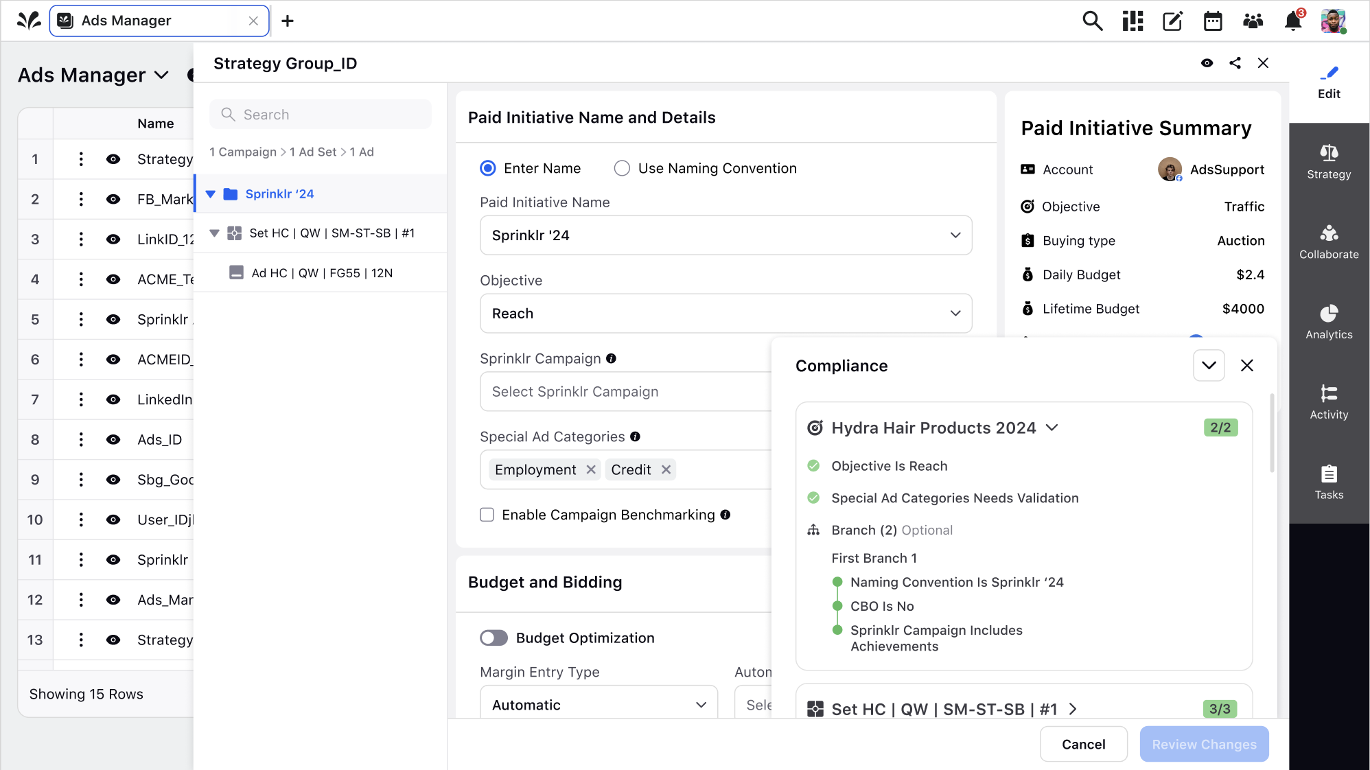
The checklist footer blocked the work it was meant to support.
In the second screen, the campaign checklist anchors itself to the bottom of the workspace and floats above the form. It covers the Sprinklr Campaign selector, Special Ad Categories, and the entire Budget and Bidding section — precisely the fields the checklist is asking the advertiser to verify.
The result is a broken loop: to act on a checklist item, users had to dismiss the checklist, scroll to find the field, update it, then reopen the panel to confirm the state had changed. Every validation item cost three extra interactions, and the disruption compounded across every ad set in a campaign.
A calmer surface that guides instead of interrupts.
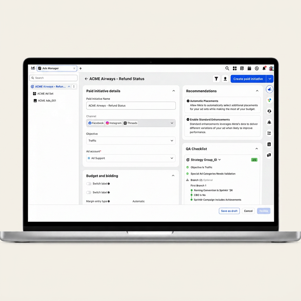
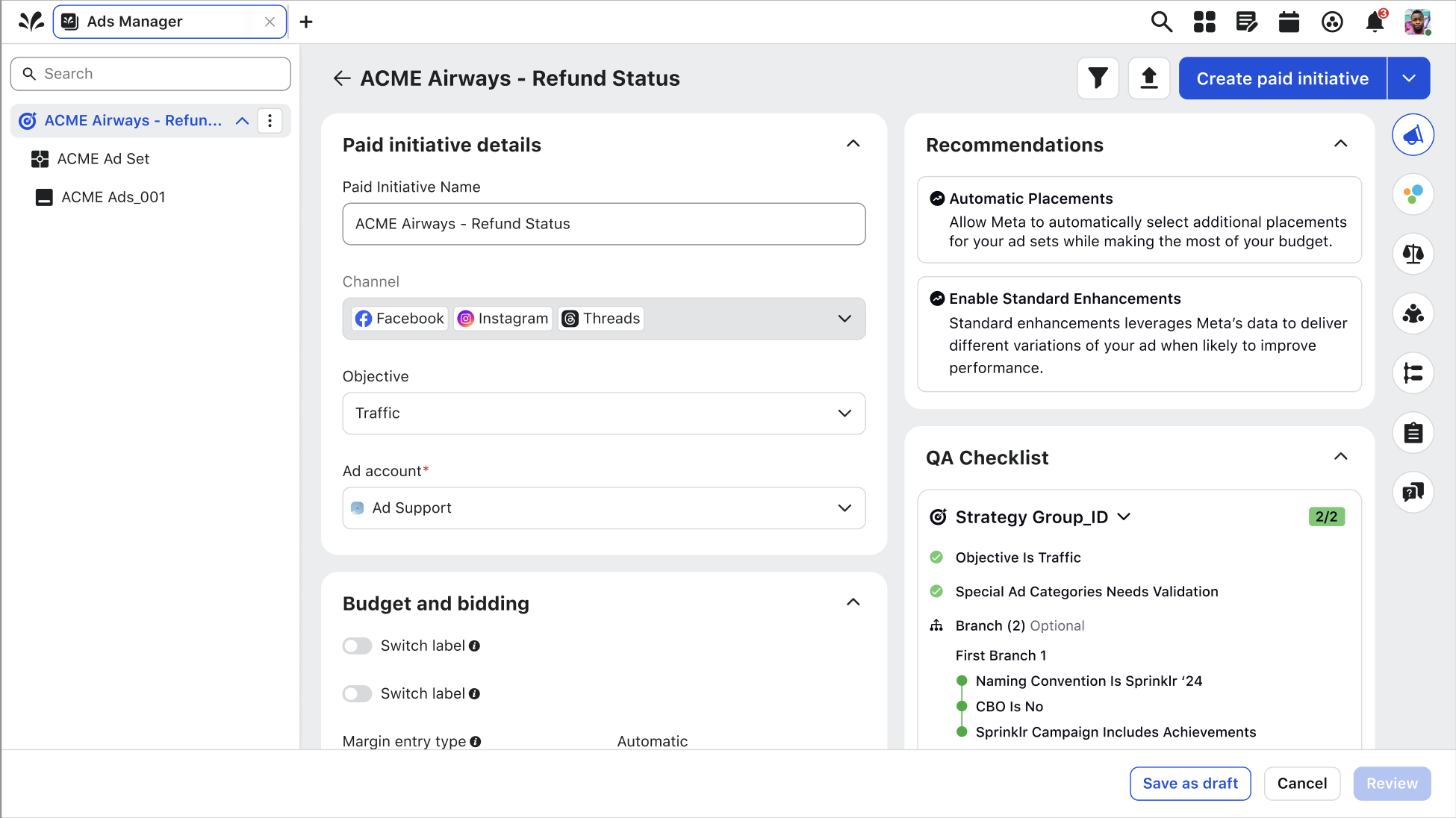
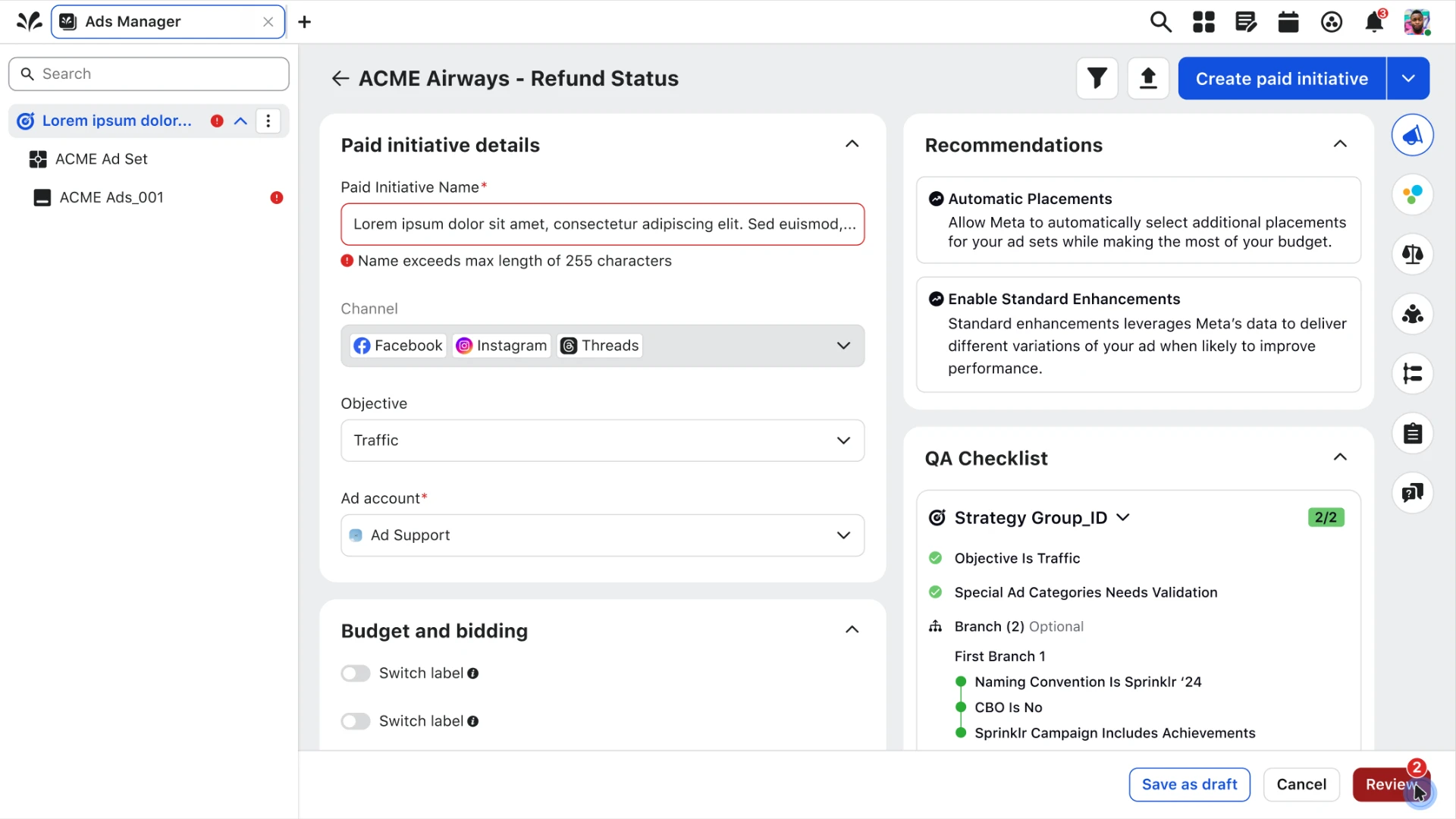
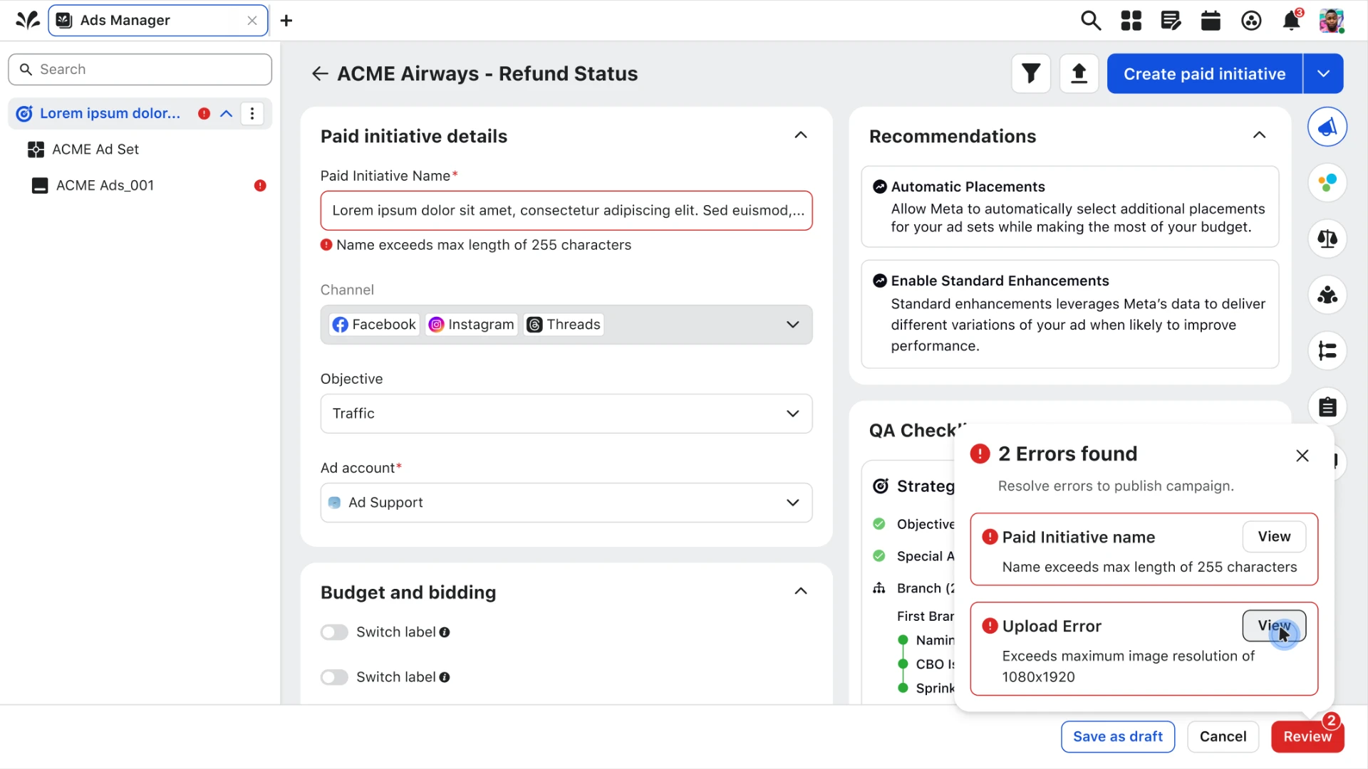
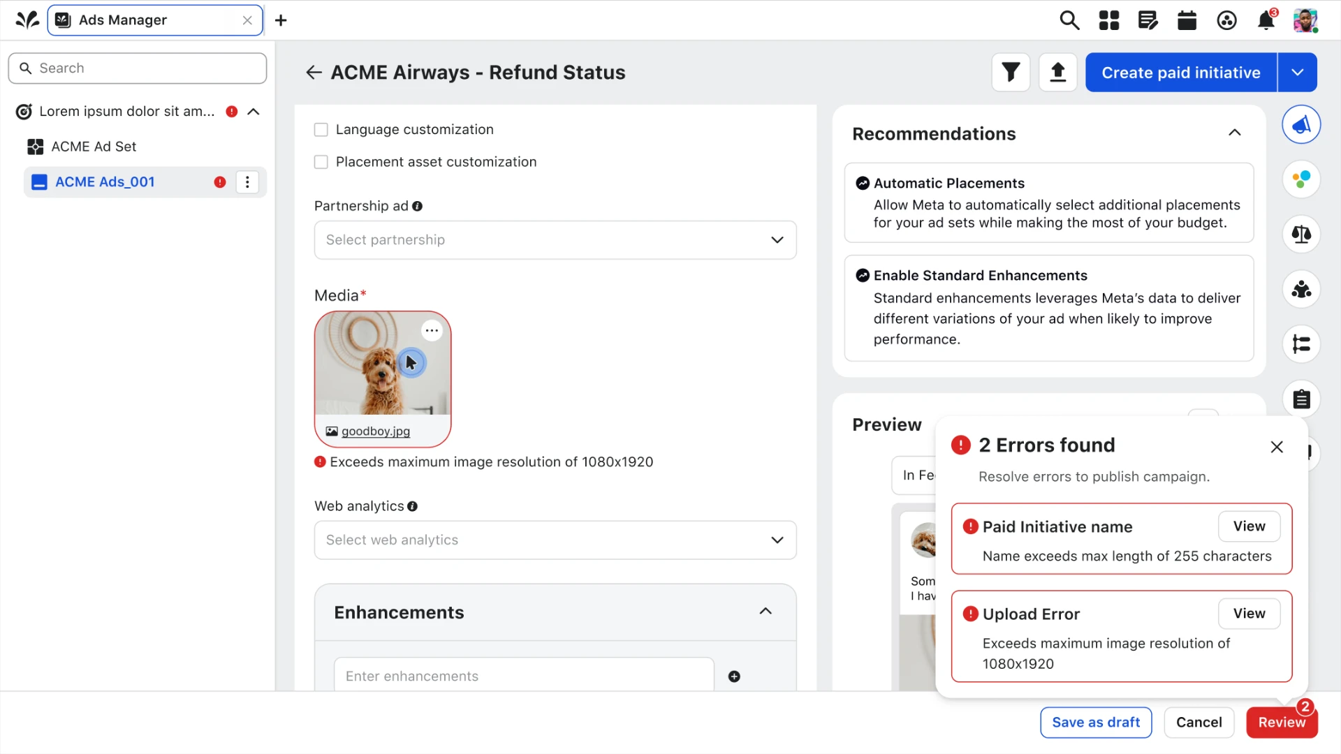
The final design resolves the three problems that surfaced most in research — complexity, cognitive overload, and error handling — into one layout that stays visually clear and lets advertisers move through a campaign efficiently.
Problems answered
Complexity
The overlay-on-overlay pattern was replaced with a single persistent workspace. Navigation lives on the left, the form in the center, and guidance on the right — each with a fixed home that never moves.
Cognitive overload
Fields are grouped into collapsible sections with clear headers, so advertisers see one decision at a time instead of the entire configuration surface at once.
Error handling
The QA Checklist is docked into the right rail alongside recommendations. It validates in place, never covers a field, and lets users resolve issues without leaving the form.
Insights into action.
- 01
Validating the Experience
Prototype was sent out to the initial internal stakeholders we met with, while also including new users that utilize the platform into the discussion to get an outside point of view.
- 02
Perspectives
After hearing users perspectives, the thoughts were positive. Users mentioned how this allows more breath and helps them focus on the task they have at hand, which is creating a strong, marketable campaign to publish to channels.
- 03
Validating, gathering perspectives, and evolving the experience.
With the positive sentiments sent to us, our next step was continue to evolve this design revamp by allocating the new experience into the roadmap with a release in progress.